the Creative Commons Attribution 4.0 License.
the Creative Commons Attribution 4.0 License.
 | 19 Jul 2019
The Met Office Weather Game: investigating how different methods for presenting probabilistic weather forecasts influence decision-making
Elisabeth M. Stephens
David J. Spiegelhalter
Ken Mylne
Mark Harrison
To inform the way probabilistic forecasts would be displayed on their website, the UK Met Office ran an online game as a mass participation experiment to highlight the best methods of communicating uncertainty in rainfall and temperature forecasts, and to widen public engagement in uncertainty in weather forecasting. The game used a hypothetical “ice-cream seller” scenario and a randomized structure to test decision-making ability using different methods of representing uncertainty and to enable participants to experience being “lucky” or “unlucky” when the most likely forecast scenario did not occur.
Data were collected on participant age, gender, educational attainment, and previous experience of environmental modelling. The large number of participants (n>8000) that played the game has led to the collation of a unique large dataset with which to compare the impact on the decision-making ability of different weather forecast presentation formats. This analysis demonstrates that within the game the provision of information regarding forecast uncertainty greatly improved decision-making ability and did not cause confusion in situations where providing the uncertainty added no further information.
- Article
(4695 KB) - Full-text XML
-
Supplement
(1404 KB) - BibTeX
- EndNote


Small errors in observations of the current state of the atmosphere as well as the simplifications required to make a model of the real world lead to uncertainty in the weather forecast. Ensemble modelling techniques use multiple equally likely realizations (ensemble members) of the starting conditions or model itself to estimate the forecast uncertainty. In a statistically reliable ensemble, if 60 % of the ensemble members forecast rain, then there is a 60 % chance of rain. This ensemble modelling approach has become common place within operational weather forecasting (Roulston et al., 2006), although the information is more typically used by forecasters to infer and then express the level of uncertainty rather than directly communicate it quantitatively to the public.
The probability of precipitation (PoP) is perhaps the only exception, with PoP being directly presented to the US public since 1965 (NRC, 2006), although originally derived using statistical techniques rather than ensemble modelling. Due to long held concerns over public understanding and lack of desire for PoP forecasts, the UK Met Office only began to present PoP in an online format in late 2011, with the BBC not including them in its app until 2018 (BBC Media Centre, 2018). However, an experimental representation of temperature forecast uncertainty was trialled on a now-discontinued section of the Met Office website called “Invent”. To move further towards the presentation of weather forecast uncertainty, a mass participation study was planned to highlight the optimal method(s) of presenting temperature and rainfall probabilities. This study aimed to build on prior studies that have addressed public understanding of the “reference class” of PoP (e.g. Gigerenzer et al., 2005; Morss et al., 2008) and decision-making ability using probabilistic forecasts (e.g. Roulston and Kaplan, 2009; Roulston et al., 2006), and to dig deeper into the conclusions that suggest that there is not a perfect “one size fits all” solution to probabilistic data provision (Broad et al., 2007).
1.1 Public understanding of uncertainty
Numerous studies have assessed how people interpret a PoP forecast, considering whether the PoP reference class is understood; e.g. “10 % probability” means that it will rain on 10 % of occasions on which such a forecast is given for a particular area during a particular time period (Gigerenzer et al., 2005; Handmer and Proudley, 2007; Morss et al., 2008; Murphy et al., 1980). Some people incorrectly interpret this to mean that it will rain over 10 % of the area or for 10 % of the time. Morss et al. (2008) find a level of understanding of around 19 % among the wider US population, compared to other studies finding a good level of understanding in New York (∼65 %) (Gigerenzer et al., 2005), and 39 % for a small sample of Oregon residents (Murphy et al., 1980). An Australian study found 79 % of the public to choose the correct interpretation, although for weather forecasters (some of whom did not issue probability forecasts) there is significant ambiguity, with only 55 % choosing the correct interpretation (Handmer and Proudley, 2007).
The factors which affect understanding are unclear, with Gigerenzer et al. (2005) finding considerable variation between different cities (Amsterdam, Athens, Berlin, Milan, New York) that could not be attributed to an individual's length of exposure to probabilistic forecasts. This conclusion is reinforced by the ambiguity among Australian forecasters, which suggests that any confusion is not necessarily caused by lack of experience. But as Morss et al. (2008) concluded, it might be more important that the information can be used in a successful way than understood from a meteorological perspective. Accordingly, Joslyn et al. (2009) and Gigerenzer et al. (2005) find that decision-making was affected by whether the respondents could correctly assess the reference class, but it is not clear whether people can make better decisions using PoP than without it.
Evidence suggests that most people surveyed in the US find PoP forecasts important (Lazo et al., 2009; Morss et al., 2008) and that the majority (70 %) of people surveyed prefer or are willing to receive a forecast with uncertainty information (with only 7 % preferring a deterministic forecast). Research also suggests that when weather forecasts are presented as deterministic the vast majority of the US public form their own nondeterministic perceptions of the likely range of weather (Joslyn and Savelli, 2010; Morss et al., 2008). It therefore seems inappropriately disingenuous to present forecasts in anything but a probabilistic manner, and, given the trend towards communicating PoP forecasts, research should be carried out to ensure that weather forecast presentation is optimized to improve understanding.
1.2 Assessing decision-making under uncertainty in weather forecasting
Experimental economics has been used as one approach to test decision-making ability under uncertainty, by incorporating laboratory-based experiments with financial incentives. Using this approach, Roulston et al. (2006) show that, for a group of US students, those that were given information on the standard error in a temperature forecast performed significantly better than those without. Similarly Roulston and Kaplan (2009) found that for a group of UK students, on average, those students provided with the 50th and 90th percentile prediction intervals for the temperature forecast were able to make better decisions than those who were not. Furthermore, they also showed more skill where correct answers could not be selected by an assumption of uniform uncertainty over time. This approach provides a useful quantification of performance, but the methodology is potentially costly when addressing larger numbers of participants. Criticism of the results has been focused on the problems of drawing conclusions from studies sampling only students, which may not be representative of the wider population; indeed, it is possible that the outcomes would be different for different socio-demographic groups. However, behavioural economics experiments enable quantification of decision-making ability, and should be considered for the evaluation of uncertain weather information.
On the other hand, qualitative studies of decision-making are better able to examine in-depth responses from participants in a more natural setting (Sivle et al., 2014), with comparability across interviewees possible by using semi-structured interviews. Taking this approach, Sivle et al. (2014) were able to describe influences external to the forecast information itself that affected a person's evaluation of uncertainty.
1.3 Presentation of uncertainty
Choosing the format and the level of information content in the uncertainty information is an important decision, as a different or more detailed representation of probability could lead to better understanding or total confusion depending on the individual. Morss et al. (2008), testing only non-graphical formats of presentation, found that the majority of people in a survey of the US public (n=1520) prefer a percentage (e.g. 10 %) or non-numerical text over relative frequency (e.g. 1 in 10) or odds. For a smaller study of students within the UK (n=90) 90 % of participants liked the probability format, compared to only 33 % for the relative frequency (Peachey et al., 2013). However, as noted by Morss et al. (2008), user preference does not necessarily equate with understanding. For complex problems such as communication of health statistics, research suggests that frequency is better understood than probability (e.g. Gigerenzer et al., 2007), but for weather forecasts the converse has been found to be true, even when a reference class (e.g. 9 out of 10 computer models predict that …) is included (Joslyn and Nichols, 2009). Joslyn and Nichols (2009) speculate that this response could be caused by the US public's long exposure to the PoP forecast, or because weather situations do not lend themselves well to presentation using the frequency approach, because unlike for health risks they do not relate to some kind of population (e.g. 4 in 10 people at risk of heart disease).
As well as assessing the decision-making ability using a PoP forecast, it is also important to look at potential methods for improving its communication. Joslyn et al. (2009) assess whether specifying the probability of no rain or including visual representations of uncertainty (a bar and a pie icon) can improve understanding. They found that including the chance of no rain significantly lowered the number of individuals that made reference class errors. There was also some improvement when the pie icon was added to the probability, which they suggested might subtly help to represent the chance of no rain. They conclude that given the wide use of icons in the media more research and testing should be carried out on the potential for visualization as a tool for successful communication.
Tak et al. (2015) considered public understanding of seven different visual representations of uncertainty in temperature forecasts among 140 participants. All of these representations were some form of a line chart/fan chart. Participants were asked to estimate the probability of a temperature being exceeded from different visualizations, using a slider on a continuous scale. They found systematic biases in the data, with an optimistic interpretation of the weather forecast, but were not able to find a clear “best” visualization type.
This study aims to address two concerns often vocalized by weather forecast providers about presenting forecast uncertainties to the public: firstly, that the public do not understand uncertainty; and secondly, that the information is too complex to communicate. Our aim was to build on the previous research of Roulston and Kaplan (2009) and Roulston et al. (2006) by assessing the ability of a wider audience (not only students) to make decisions when presented with probabilistic weather forecasts. Further, we aimed to identify the most effective formats for communicating weather forecast uncertainty by testing different visualization methods and different complexities of uncertainty information contained within them (e.g. a descriptive probability rating (low (0 %–20 %), medium (30 %–60 %), or high (70 %–100 %) compared to the numerical value).
As such our objectives are as follows:
-
to assess whether providing information on uncertainty leads to confusion compared to a traditional (deterministic) forecast;
-
to evaluate whether participants can make better decisions when provided with probabilistic rather than deterministic forecast information; and
-
to understand how the detail of uncertainty information and the method of presenting it might influence this decision-making ability.
Socio-demographic information was collected from each participant, primarily to provide information about the sample, but also to potentially allow for future study of demographic influences.
For this study we focused on two aspects of the weather forecast: precipitation, as Lazo et al. (2009) found this to be of the most interest to users and PoP has been presented for a number of years (outside the UK), and temperature, since a part of the UK Met Office website at that time included an indication of predicted temperature uncertainty (“Invent”).
The presentation formats used within this game were based on visualizations in use at the time by operational weather forecasting agencies. Seven different temperature forecast presentation formats were tested (Fig. 1), representing three levels of information content (deterministic, mean with 5th–95th percentile range, mean with 5th–95th and 25th–75th). These included table and line presentation formats (in use by the Norwegian Weather Service, https://www.yr.no/ (last access: April 2019), for their long-term probability forecast), as well as the “Invent” style as it appeared on the web, and a more simplified version based on some user feedback. Nine different rainfall forecast presentation formats were tested (Fig. 2), with three different levels of information content including one deterministic format used as a control from which to draw comparisons. The “bar format” is derived from the Australian Bureau of Meteorology website, http://www.bom.gov.au (last access: April 2019), and the “umbrella” format was intended as a pictorial representation similar to a pie chart style found on the University of Washington's Probcast website (now defunct). While there are limitless potential ways of displaying the probability of precipitation, we felt it important to keep the differences in presentation style and information content to a minimum in order to quantify directly the effect of these differences rather than aspects like colour or typeface, and so maintain control on the conclusions we are able to draw.
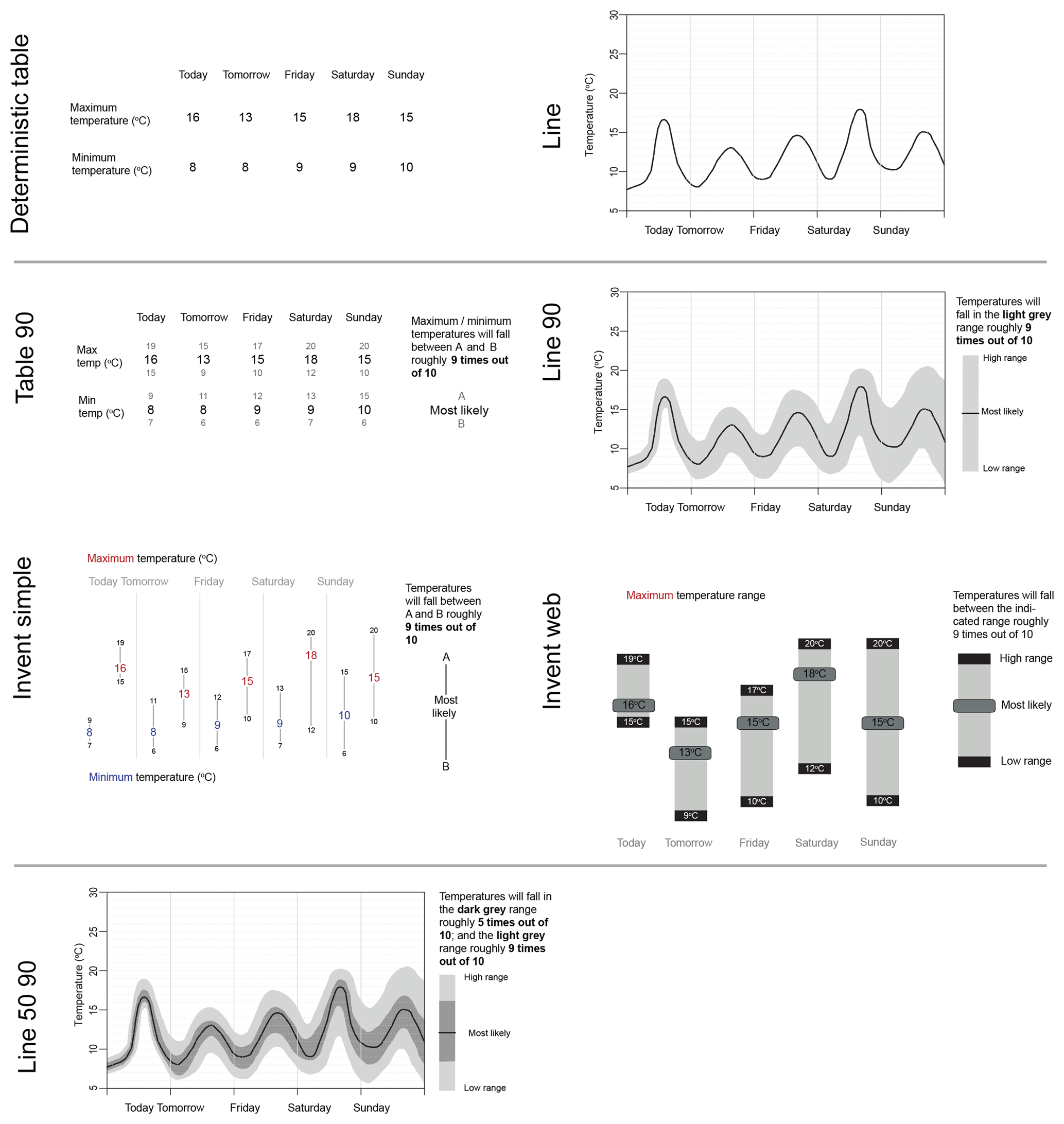
Figure 1Temperature forecast presentation formats. Two different deterministic formats used for comparison (a table and a line graph); four different ways of presenting the 5th and 95th percentiles (Table 90, Line 90, Invent Simple, Invent Web; and a more complex fan chart (Line 50 90) representing the 25th and 75th percentiles as well as the 5th and 95th shown in Line 90.
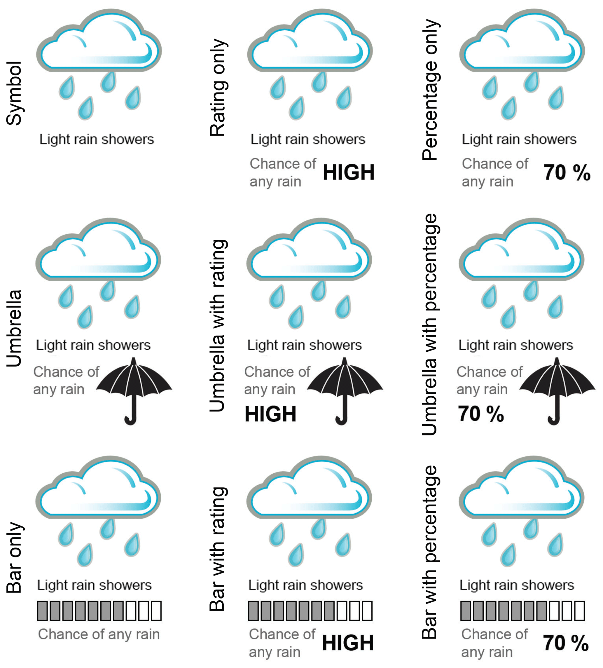
Figure 2Precipitation presentation formats, with varying levels of information content. The rating is either low (0 %–20 %), medium (30 %–60 %), or high (70 %–100 %), and the percentage is to the nearest 10 %.
Our method of collecting data for this study was an online game linked to a database. Alternative communication formats can be evaluated in terms of their impacts on cognition (comprehension), affect (preference), and behaviour (decision-making) impacts. Unpublished focus groups held by the Met Office had concentrated on user preference, but we chose to focus on comprehension and decision-making. While previous laboratory-based studies had also looked at decision-making, we hoped that by using a game we would maximize participation by making it more enjoyable, therefore providing a large enough sample size for each presentation format to have confidence in the validity of our conclusions. Since the game was to be launched and run in the UK summer it was decided to make the theme appropriate to that time of year, as well as engaging to the widest demographic possible. Accordingly, the choice was made to base the game around running an ice-cream-van business. The participants would try to help the ice-cream seller, “Brad”, earn money by making decisions based on the weather forecasts.
It is not possible to definitively address all questions in a single piece of work (Morss et al., 2008), and consequently we focussed on a participant's ability to understand and make use of the presentation formats. This study does not look at how participants might use this information in a real-life context, as this would involve other factors such as the “experiential” as well as bringing into play participants' own thresholds/sensitivities for risk. By keeping the decisions specific to a theoretical situation (e.g. by using made-up locations) we hoped to be able to eliminate these factors and focus on the ability to understand the uncertainty information.
As addressed in Morss et al. (2010), there are advantages and disadvantages with using a survey rather than a laboratory-based experiment, and accordingly there are similar pros and cons to an online game. In laboratory studies participants can receive real monetary incentives related to their decisions (see Roulston and Kaplan, 2009; Roulston et al., 2006), whereas for surveys this is likely not possible. Our solution was to make the game as competitive as possible while being able to identify and eliminate results from participants who played repeatedly to maximize their score. We also provided the incentive of the potential of a small prize to those that played all the way to the end of the game. Games have been used across the geosciences, for example to support drought decision-making (Hill et al., 2014), to promote understanding of climate change uncertainty (Van Pelt et al., 2015), and to test understanding of different visualizations of volcanic ash forecasts (Mulder et al., 2017).
Surveys are advantageous in that they can employ targeted sampling to have participants that are representative of the general population, something that might be difficult or cost-prohibitive on a large scale for laboratory studies. By using an online game format, we hoped to achieve a wide enough participation to enable us to segment the population by demographics. We thought that this would be perceived as more fun than a survey and that therefore more people would be inclined to play, as well as enabling us to use social media to promote the game and target particular demographic groups where necessary. The drawback of an online game might be that it is still more difficult to achieve the desired number of people, in particular socio-demographic groups, than if using a targeted survey.
2.1 Game structure
The information in this section provides a brief guide to the structure of the game; screenshots of the actual game can be found in the Supplement.
2.1.1 Demographic questions, ethics, and data protection
As a Met Office-led project there was no formal ethics approval process, but the ethics of the game were a consideration and its design was approved by individuals within the Met Office alongside data protection considerations. It was decided that although basic demographic questions were required to be able to understand the sample of the population participating in the game, no questions would be asked which could identify an individual. Participants could enter their email address so that they could be contacted if they won a prize (participants under 16 were required to check a box to confirm they had permission from a parent or guardian before sharing their email address); however, these emails were kept separate from the game database that was provided to the research team.
On the “landing page” of the game the logos of the Met Office, the University of Bristol (where the lead author was based at the time), and the University of Cambridge were clearly displayed, and participants were told that “Playing this game will help us to find out the best way of communicating the confidence in our weather forecasts to you”, with “More Info” taking them to a webpage telling them more about the study. On the first “Sign up” page participants were told (in bold font) that “all information will stay anonymous and private”, with a link to the Privacy Policy.
The start of the game asked some basic demographic questions of the participants: age, gender, location (first half of postcode only), and educational attainment (see Supplement), as well as two questions designed to identify those familiar with environmental modelling concepts or aware that they regularly make decisions based on risk.
-
Have you ever been taught or learnt about how scientists use computers to model the environment? (Yes, No, I'm not sure)
-
Do you often make decisions or judgements based on risk, chance or probability? (Yes, No, I'm not sure)
The number of demographic questions was kept to a minimum to maximize the number of participants that wanted to play the game. Following these preliminary questions the participant was directed immediately to the first round of game questions.
2.1.2 Game questions
Each participant played through four “weeks” (rounds) of questions, where each week asked the same temperature and rainfall questions, but with a different forecast situation. The order that specific questions were provided to participants in each round was randomized to eliminate learning effects from the analysis. The first half of each question was designed to assess a participant's ability to decide whether one location (temperature questions) or time period (rainfall questions) had a higher probability than another, and the second half asked them to decide on how sure they were that the event would occur. Participants were presented with 11 satellite buttons (to represent 0 % to 100 %, these buttons initially appeared as unselected so as not to bias choice) from which to choose their confidence in the event occurring. This format is similar to the slider on a continuous scale used by Tak et al. (2015).
Temperature questions (Fig. 4) took the following forms.
-
Which town is more likely to reach 20 ∘C on Saturday? (Check box under chosen location.)
-
How sure are you that it will reach 20 ∘C here on Saturday? (Choose from 11 satellite buttons on a scale from “certain it will not reach 20 ∘C” to “certain it will reach 20 ∘C”.)
Rainfall questions (Fig. 5) took the following forms.
-
Pick the three shifts where you think it is least likely to rain.
-
How sure are you that it will not rain in each of these shifts? (Choose from 11 satellite buttons on a scale from “certain it will not rain” to “certain it will rain”.)
2.1.3 Game scoring and feedback
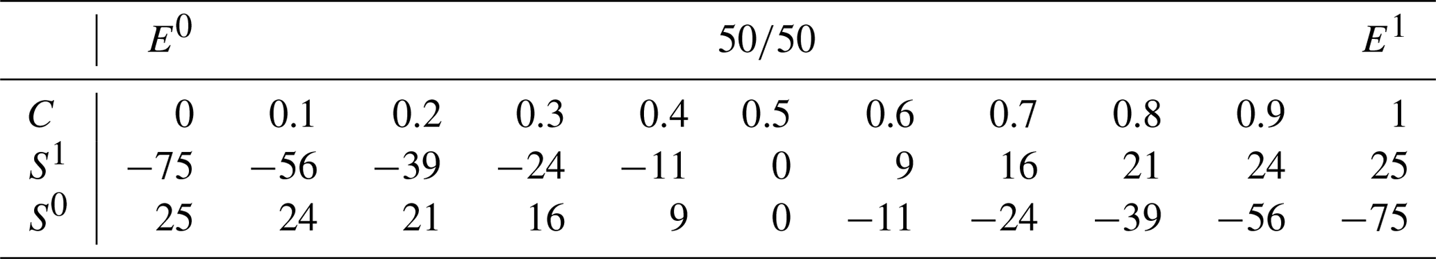
The outcome to each question was generated “on the fly” based on the probabilities defined from that question's weather forecast (and assuming a statistically reliable forecast). For example, if the forecast was for an 80 % chance of rain, 8 out of 10 participants would have a rain outcome, and 2 out of 10 would not. Participants were scored (S) based on their specified confidence rating (C) and the outcome, using an adjustment of the Brier score (BS) (see Table 1), so that if they were more confident they had more to gain but also more to lose. So if the participants state a probability of 0.5 and it does rain, BS=0.75 and S=0; if the probability stated is 0.8 and it does rain, BS=0.96 and S=21; if the probability stated is 0.8 and it does not rain, BS=0.36 and .
This scoring method was chosen as we wanted participants to experience being unlucky, i.e. that they made the right decision but the lower probability outcome occurred. This meant that they would not necessarily receive a score that matched their decision-making ability, although if they were to play through enough rounds, then on average those that chose the correct probability would achieve the best score.
Table 1Game scoring based on an adjustment (1) of the Brier score (BS) (2), where C is the confidence rating, E is the expected event, and S is the score for the actual outcome (x), where x=1 if the event occurs and x=0 if it does not.
For a participant to understand when they were just “unlucky”, we felt it important to provide some kind of feedback as to whether they had accurately interpreted the forecast or not. It was decided to give players traffic light coloured feedback corresponding to whether they had been correct (green), correct but unlucky (amber), incorrect but lucky (amber), or incorrect (red). The exact wording of these feedback messages was the subject of much debate. Many of those involved in the development of the weather game who have had experience communicating directly to the public were concerned about the unintended consequences of using words such as “lucky” and “unlucky”, for example, that it could be misinterpreted that there is an element of luck in the forecasting process itself, rather than the individual being “lucky” or “unlucky” with the outcome. As a result the consensus was to use messaging such as “You provided good advice, but on this occasion it rained”.
2.2 Assessing participants
Using the data collected from the game, it is possible to assess whether participants made the correct decision (for the first part of each question) and how close they come to specifying the correct confidence (for the second part of each question). For the confidence question we remove the influence of the outcome on the result by assessing the participant's ability to rate the probability compared to the “actual” probability. The participant was asked for the confidence for the choice that they made in the first half of the question, so not all participants would have been tasked with interpreting the same probability.
3.1 Participation
Using traditional media routes and social media to promote the game, we were able to attract 8220 unique participants to play the game through to the end, with 11 398 total plays because of repeat players. The demographic of these participants was broadly typical of the Met Office website, with a slightly older audience, with higher educational attainment, than the wider Internet might attract (see Fig. 3). Nevertheless, there were still over 300 people in the smallest age category (under 16s) and nearly 500 people with no formal qualifications.
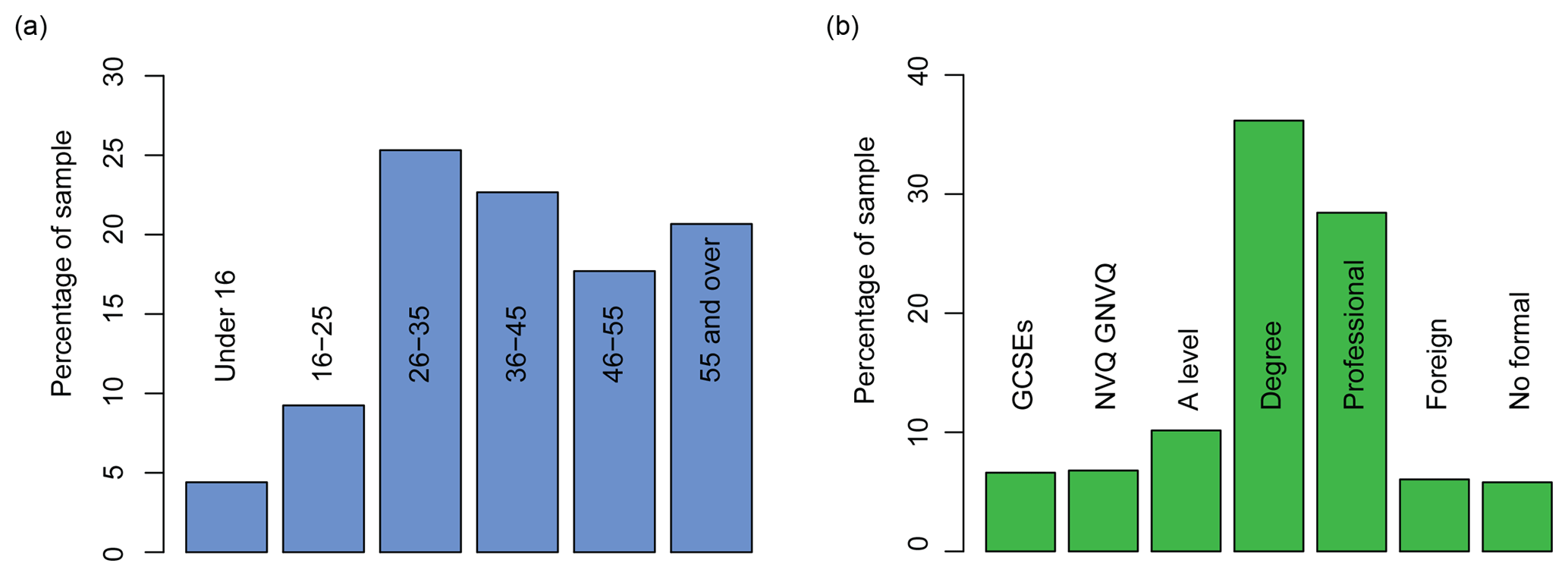
Figure 3Educational attainment and age structure of participants. Full description of educational attainment in the Supplement (professional includes professional with degree).
3.2 Assessing participant outcomes
Before plotting the outcomes we removed repeat players, leaving 8220 participants in total. It should be noted that for the confidence questions we found that many people specified the opposite probability, perhaps misreading the question and thinking that it referred to the chance of “no rain” rather than “any rain” as the question specified. We estimate that approximately 15 % of participants had this misconception, although this figure might vary for different demographic groups: it is difficult to specify the exact figure since errors in understanding of probability would also exhibit a similar footprint in the results.
For the first part of the temperature and rainfall questions the percentage of participants who make the correct decision (location choice or shift choice) is calculated. In Figs. 4 and 5 bar plots present the proportion of participants who get the question correct, and error bars have been determined from the standard error of the proportion (SEp) (Eq. 3). In Figs. 6a and 7a bar plots have been used to present the mean proportion of the four questions that each participant answers correctly, and error bars have been determined from the standard error of the sample mean (Eq. 4). The boxplots in Figs. 6b and 7b include notches that represent the 95 % confidence interval around the median.
3.3 Results from temperature questions
Figure 4a shows the forecasts presented in the temperature questions for each of the four questions (weeks), Fig. 4b presents the percentage of correct responses for the choice in the first part of the question for each presentation format, and Fig. 4c presents the error between the actual and chosen probability in the location chosen for each presentation format.
The scenario in Question 1 was constructed so that it was possible to make the correct choice regardless of the presentation format. The results show that the vast majority of participants presented with each presentation format correctly chose Stonemouth as the location where it was most likely to reach 20 ∘C. There was little difference between the presentation formats, though more participants presented with the line format made the correct choice than for the table format, despite them both having the same information content. Participants with all presentation formats had the same median probability error if they correctly chose Stonemouth. Small sample sizes for Rockford (fewer people answered the first question incorrectly) limit comparison for those results, as shown by the large notch sizes.
The scenario in Question 2 was for a low probability of reaching 20 ∘C, with only participants provided with presentation formats that gave uncertainty information able to see the difference between the two uncertainty ranges and determine Rockford as the correct answer. The results show that most participants correctly chose Rockford regardless of the presentation format. In this case the line format led to poorer decisions than the table format on average, despite participants being provided with the same information content. Invent Web, Invent Simple, and Line 50 90 were the best presentation formats for the first part of Question 2. For Rockford in the second part of the question only participants given the line and Table 90 presentation formats had a median error of 0, with other uncertainty formats leading to an overestimation compared to the true probability of 30 %. Those presented with Line 50 90 who interpreted the graph accurately would have estimated a probability of around 25 %; however, other than Table 90 the results are no different from the other presentation formats which present the 5th to 95th percentiles, suggesting that participants were not able to make use of this additional information.
Question 3 was similar to Question 2 in that only participants provided with presentation formats that gave uncertainty information were able to determine the correct answer (Stoneford), but in this scenario the probability of reaching 20 ∘C is high in both locations. Fewer participants were able to select the correct location than in Question 2. However, fewer than 50 % (getting it right by chance) of those presented with the table or line answered correctly, showing that they were perhaps more influenced by the forecast for other days (e.g. “tomorrow” had higher temperature for Stoneford) than the forecast for the day itself. For the scenario in this question fewer participants with the Line 50 90 format answered the question correctly than other formats that provided uncertainty information. Despite this, all those that answered the location choice correctly did fairly well at estimating the probability; the median response was for a 90 % rather than 100 % probability, which is understandable given that they were not provided with the full distribution, only the 5th to 95th percentiles. Despite getting the location choice wrong, those with Line 90 or Line 50 90 who estimated the probability had a similar though opposite error to their counterparts who answered the location choice correctly.
The location choice in Question 4 was designed with a skew to the middle 50 % of the distribution so that only those given the Line 50 90 presentation format would be able to identify Stoneford correctly; results show that over 70 % of participants with that format were able to make use of it. As expected, those without this format made the wrong choice of location, and given that the percentage choosing the correct location was less than 50 % (getting it right by chance), it suggests that the forecast for other days may have influenced their choice (e.g. “Friday” had higher temperatures in Rockford). Participants with Line 50 90 who made the correct location choice were better able to estimate the true probability (median error = 0) than those who answered the first half of the question incorrectly. Participants without Line 50 90 who answered the location choice correctly as Stoneford on average underestimated the actual probability; this is expected given that they did not receive information that showed the skew in the distribution, the converse being true for “Rockford”.
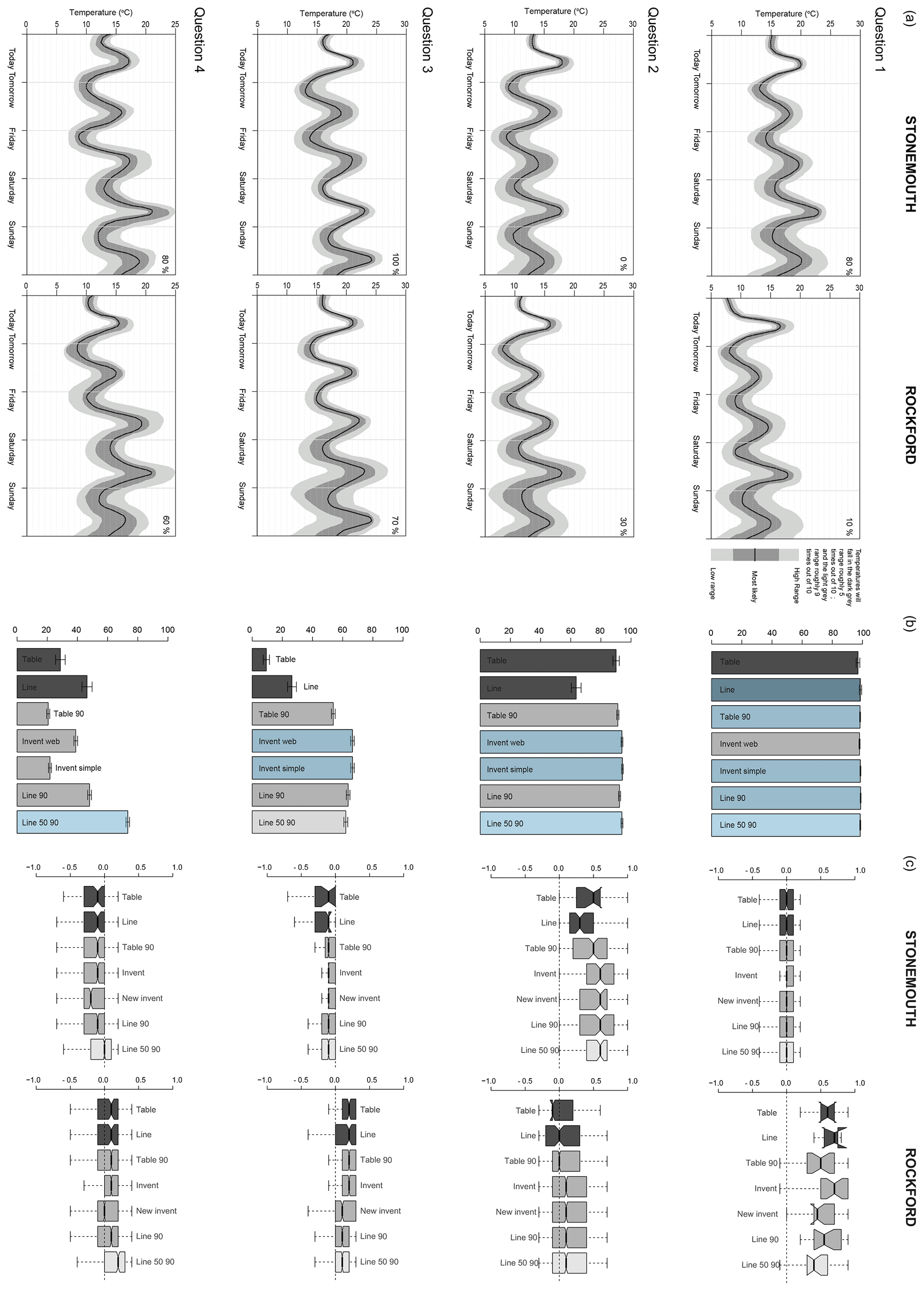
Figure 4(a) Temperature questions presented to each participant (the format shown is “line 50 90”); (b) percentage of correct answers for the location choice (blue shading indicates the “best” performing format); and (c) mean error between stated and actual probability.
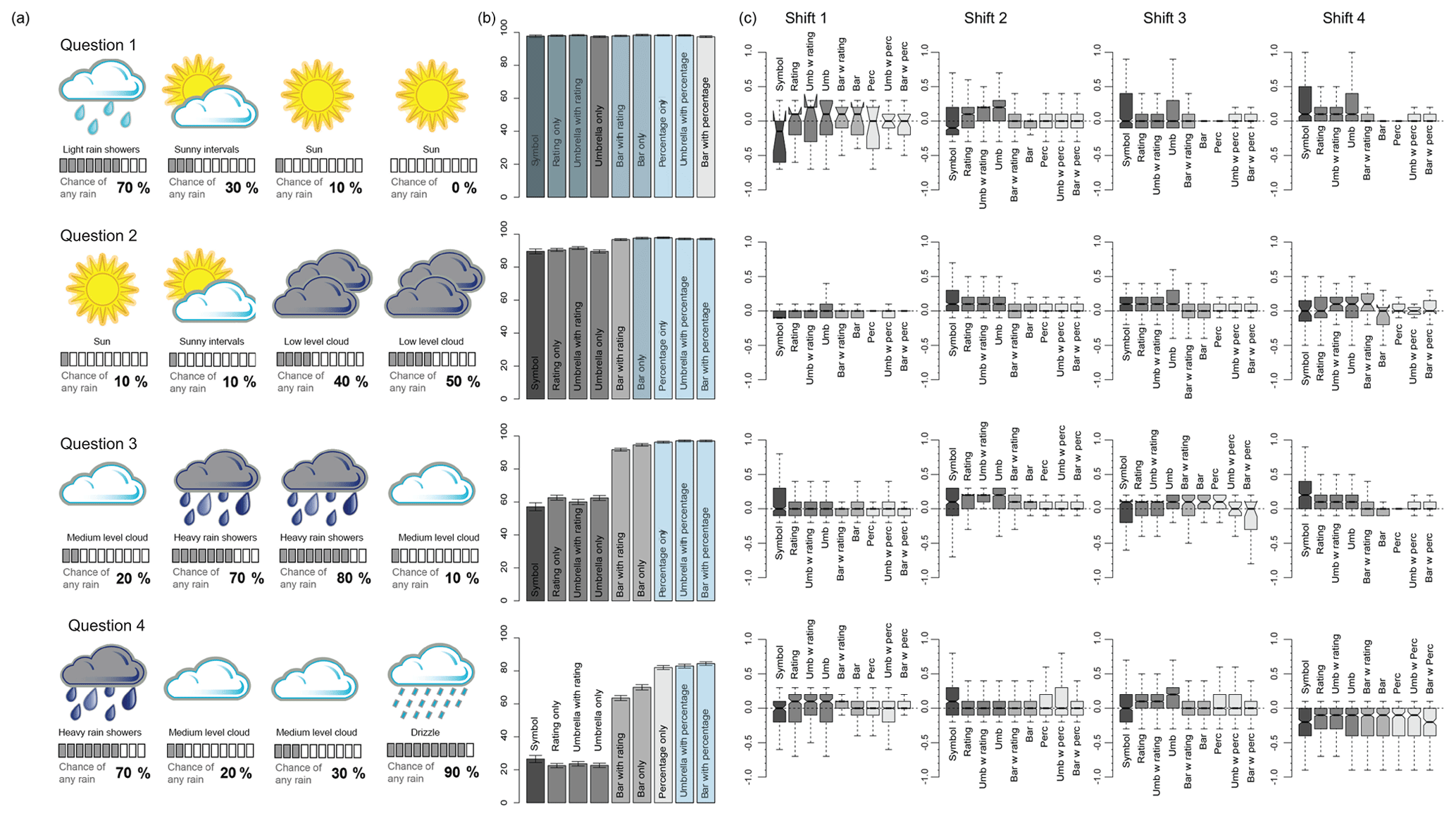
Figure 5(a) Rainfall questions presented to each participant (the format shown is “Bar with percentage”); (b) percentage of correct answers for the shift choice (blue shading indicates the “best” performing format); and (c) mean error between chosen and actual probability.
3.4 Results from rainfall questions
Figure 5a shows the forecasts presented in the rainfall questions for each of the four questions (shifts), Fig. 5b presents the percentage of correct responses for the choice in the first part of the question for each presentation format, and Fig. 5c presents the error between the actual and chosen probability in the shifts chosen for each presentation format.
Question 1 was designed so that participants were able to correctly identify the shifts with the lowest chance of rain (Shifts 2, 3, and 4) regardless of the presentation format they were given. Accordingly the results for the shift choice show that there is no difference in terms of presentation format. For the probability estimation Shift 1 can be ignored due to the small sample sizes, as shown by the large notches. For Shift 2 the median error in probability estimation was 0 for any presentation format, which gave a numerical representation. Those given the risk rating overestimated the true chance of rain in Shift 2 (“medium”, 30 %), were correct in Shift 3 (“low”, 10 %), and overestimated it in Shift 4 (“low”, 0 %), showing that risk ratings are ambiguous.
Question 2 was set up so that participants could only identify the correct shifts (Shifts 1, 2, and 3) if they were given a numerical representation of uncertainty; the difference in probability between Shifts 3 (“medium”, 40 %) and 4 (“medium”, 50 %) cannot be identified from the rating alone. The results (Fig. 5b, Q2) confirmed that those with numerical representations were better able to make use of this information, though “Bar with Rating” showed fewer lower correct answers. Despite this, over 80 % of those with the deterministic forecast, or with just the rating, answered the question correctly. This suggests an interpretation based on a developed understanding of weather; the forecasted situation looks like a transition from dryer to wetter weather. For the probability estimation participants with presentation formats with a numerical representation did best across all shifts, with the results for “Perc” giving the smallest distribution in errors.
Question 3 presented a scenario whereby the correct decision (Shifts 1, 2, and 4) could only be made with the numerical representation of probability, and not a developed understanding of weather. Consequently the results show a clear difference between the presentation formats which gave the numerical representation of uncertainty compared to those that did not, though again “Bar with Rating” showed fewer correct answers. The results also show that participants provided with the probability rating do not perform considerably differently from those with the symbol alone, perhaps suggesting that the weather symbol alone is enough to get a rough idea of the likelihood of rain. For this question the percentage on its own led to a lower range of errors in probability estimation as also found for Question 2.
The scenario in Question 4 was designed to test the influence of the weather symbol itself by incorporating two different types of rain: “drizzle” (“high”, 90 %) and “heavy rain showers” (“high”, 70 %). Far fewer participants answered correctly (Shifts 1, 2, and 3) when provided with only the rating or symbol, showing that when not provided with the probability information they think the “heavier” rain is more likely. This appears to hold true for those given the probability information too, given that fewer participants answered correctly than in Question 2. This seemed to lead to more errors in the probability estimation too, with all presentation formats underestimating the probability of rain for “drizzle” (though only those who answered incorrectly in the first part of the question would have estimated the probability for Shift 4).
4.1 Does providing information on uncertainty lead to confusion?
We set up Question 1 (Q1) for both the temperature and rainfall questions as a control by providing all participants with enough information to make the correct location/shift choice regardless of the presentation format that they were assigned. The similarity in the proportion of people getting the answer correct for each presentation format in this question (Figs. 4 and 5) demonstrates that providing additional information on the uncertainty in the forecast does not lead to any confusion compared to deterministic presentation formats. Given the small sample size when using subgroups of subgroups, we cannot conclude with any confidence whether age and educational attainment are significant influences on potential confusion.
Previous work has shown that the public infer uncertainty when a deterministic forecast is provided (Joslyn and Savelli, 2010; Morss et al., 2008). Our results are no different; looking in detail at the deterministic “symbol only” representation for Q1 of the rainfall questions (a “sun” symbol forecast), 43 % of participants indicated some level of uncertainty (i.e. they did not specify the correct value of 0 % or misread the question and specify 100 %). This shows that a third of people place their own perception of uncertainty around the deterministic forecast. Where the forecast is for “sunny intervals” rather than “sun” this figure goes up to 67 %. Similarly for Q1 of the temperature questions, even when the line or the table states (deterministically) that the temperature will be above 20∘, the confidence responses for those presentation formats shows that the median confidence from participants is an 80 % chance of that temperature being reached.
4.2 What is the best presentation format for the probability of precipitation?
The amount of uncertainty that participants infer around the forecast was examined by looking at responses for a shift where a 0 % chance of rain is forecast (see Fig. 5, Q1, shift 4). For this question, participants were given a “sun” weather symbol, and/or a “low” rating or 0 % probability. The presentation formats that lead to the largest number of precise interpretations of the actual probability are “Bar Only” and “Perc”, but the results are similar for any of the formats that provide some explicit representation of the probability.
Participants that were assigned formats that specified the probability rating (high/medium/low) gave fewer correct answers, presumably because they were told that there was a “low” rather than “no” chance of rain. Arguably this is a positive result, since it indicates that participants take into account the additional information and are not just informed by the weather symbol. However, it also highlights the potential problem of being vague when forecasters are able to provide more precision. Providing a probability rating could limit the forecaster when there is a very small probability of rain; specifying a rating of “low” is perhaps too vague, and specifying “no chance” is more akin to a deterministic forecast. While forecast systems are only really able to provide rainfall probabilities reliably to the nearest 10 %, different people have very different interpretations of expressions such as “unlikely” (Patt and Schrag, 2003), so the use of numerical values, even where somewhat uncertain, is perhaps less ambiguous.
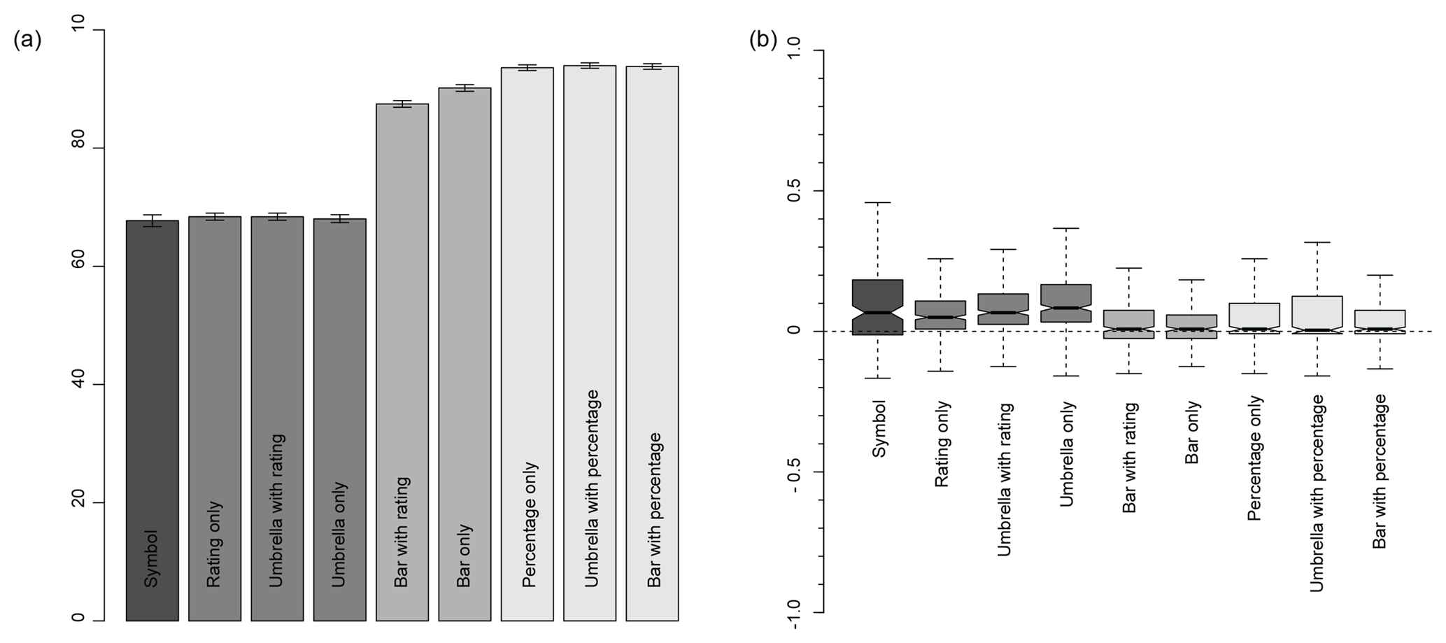
Figure 6For each presentation format: (a) mean of the percentage of questions each participant answers correctly (error bars show standard error); (b) mean difference between the actual and participant's specified probability (where notches on boxplots do not overlap, there is a significant difference between the median values; positive values (negative values) represent an overestimation (underestimation) of the actual probability).
The ability of participants to make the correct rainfall decision using different ways of presenting the PoP forecast is shown in Fig. 6a. Figure 6b shows the average difference between the actual probability and the confidence specified by each participant for each presentation format. The best format would be one with a median value close to zero and a small range. Obviously we would not expect participants who were presented with a symbol or only the probability rating to be able to provide precise estimates of the actual probability, but the results for these formats can be used as a benchmark to determine whether those presented with additional information content are able to utilize it.
Joslyn et al. (2009) find that using a pie graphic reduces reference class errors of PoP forecasts (although not significantly), and so it was hypothesized that providing a visual representation of uncertainty might improve decision-making ability and allow participants to better interpret the probability.
For the first part of the rainfall question the best presentation formats are those where the percentage is provided explicitly. The error bars overlap for these three formats, so there is no definitive best format identified from this analysis. Participants who were presented with “Bar + Rating” or “Bar Only” did not perform as well, despite these presentation formats containing the same information. This suggests that provision of the PoP as a percentage figure is vital for optimizing decision-making. Note that participants who were not presented with a bar or percentage would not have been able to answer all four questions correctly without guessing.
For the second part of the rainfall question (Fig. 6b), there is no significant difference in the median values for any of the formats that explicitly present the probability; the “Bar Only” format is perhaps the best due to having the smallest range. This result suggests that providing a good visual representation of the probability is more helpful than the probability itself, though equally the bar may just have been more intuitive within this game format for choosing the correct satellite button.
An interesting result, although not pertinent for presenting uncertainty, is that the median for those participants who are only provided with deterministic information is significantly more than 0, and therefore they are, on average, overestimating the chance of rain given the information. The overestimation of probabilities for Q3 Shifts 2 and 3, and Q4 Shift 1 (Fig. 5), where heavy rain showers were forecast with chances of rain being “high”, shows that this may largely have to do with an overestimation of the likelihood of rain when a rain symbol is included, though interestingly this is not seen for the drizzle forecast in Q4 Shift 4, where all participants underestimate the chance of rain, or for the light rain showers in Q1 Shift 1. This replicates the finding of Sivle et al. (2014) which finds that some people anticipate a large amount of rain to be a more certain forecast than a small amount of rain. Further research could address how perceptions of uncertainty are influenced by the weather symbol, and if this perception is well-informed (e.g. how often does rain occur when heavy rain showers are forecast).
4.3 What is the best presentation format for temperature forecasts?
The results for the different temperature presentation formats in each separate question (Fig. 4) are less consistent than those for precipitation (Fig. 5), and the difference between estimated and actual probabilities shows much more variability. It is expected that participants would find it more difficult to infer the correct probability within the temperature questions; this is because they have to interpret the probability rather than be provided with it, as in the rainfall questions. The game was set up to mirror reality in terms of weather forecast provision; rain/no rain is an easy choice for presentation of a probability, but for summer temperature at least there is no equivalent threshold (arguably the probability of temperature dropping below freezing is important in winter).
In Q4 around 70 % of participants are able to make use of the extra level of information in Line 50 90, but in Q3 this extra uncertainty information appears to cause confusion compared to the more simplex uncertainty representations. The difference in the responses between Q2 and Q3 is interesting: a 50 % correct result would be expected for the deterministic presentation formats because they have the same forecast for the Saturday, so the outcomes highlight that participants are being influenced by some other factor, perhaps the temperature on adjacent days.
Ignoring Line 50 90 because of this potential confusion, Fig. 7a suggests that Line 90 may be the best presentation format for temperature forecasts. This would also be the conclusion for Fig. 7b, though a smaller sample size within the deterministic formats means that the median value is not significantly different from that for the line presentation format. Like Tak et al. (2015), an over-optimistic assessment of the likelihood of exceeding the temperature threshold has been found, with all presentation formats overestimating the probability. However, the average of all the questions does not necessarily provide a helpful indicator of the best presentation format because only four scenarios were tested, so the results in Fig. 7 should be used with caution; the low standard errors reflect only the responses for the questions that were provided.
The differences between the two different ways of presenting the deterministic information (table and line), shown in Fig. 4, are of note because the UK Met Office currently provides forecasts in a more tabular format. For Q2 and Q3 of the scenarios presented in this paper participants would be expected to get the correct answer half of the time if they were only looking at the forecast values specific to the day of interest (Saturday). The deviation of the responses from 50 % shows that further work is needed to address how people extract information from a presentation format. For example, Sivle (2014) finds (from a small number of interviews) that informants were looking at weather symbols for the forecasts adjacent to the time period they were interested in. While this study (and many others) has focussed on the provision of information on weather forecast uncertainty, it may be vital to also study differences in interpretation of deterministic weather forecast presentation formats (from which a large proportion of people infer uncertainty). This is also critical for putting in context the comparisons with presentation formats that do provide uncertainty information. Figure 4 shows that the differences between different deterministic presentation formats are of the same magnitude as the differences between the deterministic and probabilistic formats.
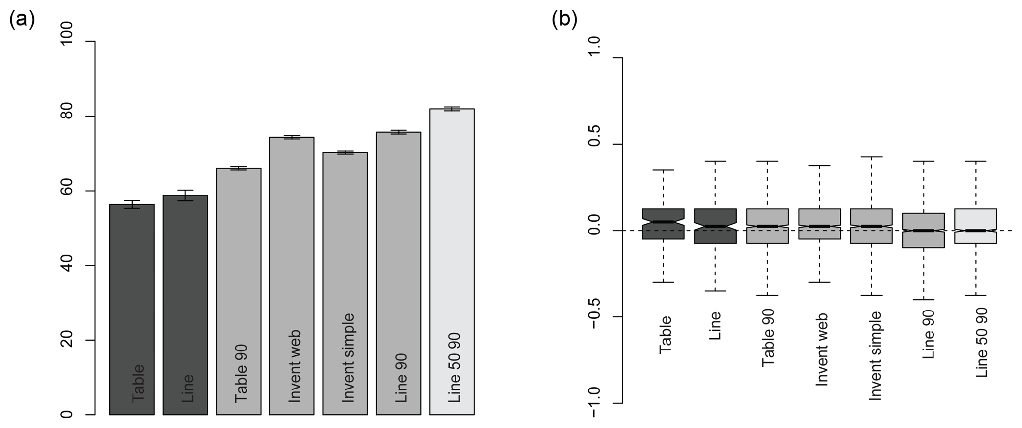
Figure 7For each presentation format: (a) mean of the percentage of questions each participant answers correctly (error bars show standard error); (b) mean difference between the actual and participant's specified probability (where notches on boxplots do not overlap, there is significant difference between the median values; positive values (negative values) represent an overestimation (underestimation) of the actual probability).
4.4 How could the game be improved?
The main confounding factor within the results is how a particular weather scenario influenced a participant's interpretation of the forecast (e.g. the drizzle result or the influence of temperature forecasts for adjacent days). The game could be improved by including a larger range of weather scenarios, perhaps generated on the fly, to see how the type of weather influences interpretation. In practice this sounds simple, but this is quite complex to code to take into account a plausible range of probabilities of rainfall for each weather type (e.g. an 80 % chance of rain is not likely for a “sun” symbol), or that temperatures are unlikely to reach a maximum of 0 ∘C one day and 25 ∘C the next (at least not in the UK).
The randomization of the presentation format, week order, and outcome (based on the probability) was significantly complex to code, so adding additional complexity without losing some elsewhere might be unrealistic. Indeed, manually generating 16 realistic rainfall forecasts (4 weeks and four shifts), 8 realistic temperature forecasts (4 weeks and two locations), and then the nine (former) and seven (latter) presentation formats for each was difficult enough.
The game format is useful for achieving large numbers of participants, but the game cannot replicate the real-life costs of decision-making, and therefore players might take more risks than they would in real life. While the aim was to compare different presentation formats, it is possible that some formats encourage or discourage this risk-taking more than others, especially if they need more time to interpret. A thorough understanding of how weather scenarios influence forecast interpretation should be achieved by complementing game-based analysis such as this with qualitative methodologies such as that adopted by Sivle et al. (2014), which was also able to find that weather symbols were being interpreted differently to how the Norwegian national weather service intended.
4.5 How could this analysis be extended?
While it is not possible to break down the different presentation formats by socio-demographic influences, it is possible using an ANOVA analysis to see where there are interactions between different variables. For example, an ANOVA analysis for the mean error in rain confidence shows that there is no interaction between the information content of the presentation format (e.g. deterministic, symbol, probability) and the age or gender of the participant, but there is with their qualification (P value of ; see Sect. S2 of the Supplement). Initial analysis suggests subtle differences between participants who have previously been taught or learnt about uncertainty compared to those who have not (see Sect. S4, Supplement), and further analysis could explore this in more detail at the level of individual questions.
A full exploration of socio-demographic effects for both choice and confidence question types for rainfall and temperature forecasts is beyond the scope of this paper, but we propose that further work could address this, and indeed the dataset is available to do so. However, preliminary analysis points to unnecessary scepticism that the provision of probabilistic forecasts would lead to poorer decisions for those with lower educational attainment; when presented with the probability only, 69 % of participants with GCSE-level qualifications answered all four questions correctly (compared to 86 % of participants who had attained a degree). In contrast, participants with GCSE-level qualifications only got 15 % of the questions right when presented with the weather symbol.
This study used an online game to build on the current literature and further our understanding of the ability of participants to make decisions using probabilistic rainfall and temperature forecasts presented in different ways and containing different complexities of probabilistic information. Employing an online game proved to be a useful format for both maximizing participation in a research exercise and widening public engagement in uncertainty in weather forecasting.
Eosco (2010) states the necessity of considering visualizations as sitting within a larger context, and we followed that recommendation by isolating the presentation format from the potential influence of the television or web forecast platform where it exists. However, these results should be taken in the context of their online game setting – in reality the probability of precipitation and the temperature forecasts would likely be set alongside wider forecast information, and therefore it is conceivable that this might influence decision-making ability. Further, this study only accounts for those participants who are computer-literate, which might influence our results.
We find that participants provided with the probability of precipitation on average scored better than those without it, especially those who were presented with only the “weather symbol” deterministic forecast. This demonstrates that most people provided with information on uncertainty are able to make use of this additional information. Adding a graphical presentation format alongside (a bar) did not appear to help or hinder the interpretation of the probability, though the bar formats without the numerical probability alongside aided decision-making, which is thought to be linked to the game design which asked participants to select a satellite button to state how sure they were that the rain–temperature threshold would be met.
In addition to improving decision-making ability, we found that providing this additional information on uncertainty alongside the deterministic forecast did not cause confusion when a decision could be made by using the deterministic information alone. Further, the results agreed with the findings of Joslyn and Savelli (2010), showing that people infer uncertainty in a deterministic weather forecast, and it therefore seems inappropriate for forecasters not to provide quantified information on uncertainty to the public. The uncertainty in temperature forecast is not currently provided to the public by either of these websites.
The Met Office started presenting the probability of precipitation on its website in late 2011. BBC Weather included it in their online weather forecasts in 2018.
The dataset analysed within this paper is available under licence from https://doi.org/10.17864/1947.198 (Stephens et al., 2019).
The supplement related to this article is available online at: https://doi.org/10.5194/gc-2-101-2019-supplement.
All authors contributed to the design of the game. EMS analysed the results and wrote the manuscript. All authors contributed comments to the final version of the manuscript.
The authors declare that they have no conflict of interest.
This project (IP10-022) was part of the programme of industrial mathematics internships managed by the Knowledge Transfer Network (KTN) for Industrial Mathematics, and was co-funded by EPSRC and the Met Office. The authors would like to thank their colleagues at the Met Office for feedback on the design of the game, the technological development, and the support in promoting the game to a wide audience. Software design was delivered by the TwoFour digital consultancy.
This paper was edited by Sam Illingworth and reviewed by Christopher Skinner and Rolf Hut.
BBC Media Centre: BBC Weather launches a new look, available at: http://www.bbc.co.uk/mediacentre/latestnews/2018/bbc-weather (last access: April 2019), 2018.
Broad, K., Leiserowitz, A., Weinkle, J., and Steketee, M.: Misinterpretations of the “Cone of Uncertainty” in Florida during the 2004 Hurricane Season, B. Am. Meteorol. Soc., 88, 651–668, https://doi.org/10.1175/BAMS-88-5-651, 2007.
Eosco, G.: Pictures may tell it all: The use of draw-and-tell methodology to understand the role of uncertainty in individuals' hurricane information seeking processes, Fifth Symposium on Policy and Socio-economic Research, Second AMS Conference on International Cooperation in the Earth System Sciences and Services, available at: https://ams.confex.com/ams/90annual/techprogram/paper_164761.htm (last access: April 2019), 2010.
Gigerenzer, G., Hertwig, R., Van Den Broek, E., Fasolo, B., and Katsikopoulos, K. V.: “A 30 % chance of rain tomorrow”: How does the public understand probabilistic weather forecasts?, Risk Anal., 25, 623–629, https://doi.org/10.1111/j.1539-6924.2005.00608.x, 2005.
Gigerenzer, G., Gaissmaier, W., Kurz-Milcke, E., Schwartz, L. M., and Woloshin, S.: Helping doctors and patients make sense of health statistics, Psychol. Sci. Publ. Int., 8, 53–96, https://doi.org/10.1111/j.1539-6053.2008.00033.x, 2007.
Handmer, J. and Proudley, B.: Communicating uncertainty via probabilities: The case of weather forecasts, Environ. Hazards-UK, 7, 79–87, https://doi.org/10.1016/j.envhaz.2007.05.002, 2007.
Hill, H., Hadarits, M., Rieger, R., Strickert, G., Davies, E. G., and Strobbe, K. M.: The Invitational Drought Tournament: What is it and why is it a useful tool for drought preparedness and adaptation?, Weather Clim. Extrem., 3, 107–116, https://doi.org/10.1016/j.wace.2014.03.002, 2014.
Joslyn, S. L. and Nichols, R. M.: Probability or frequency? Expressing forecast uncertainty in public weather forecasts, Meteorol. Appl., 16, 309–314, https://doi.org/10.1002/met.121, 2009.
Joslyn, S. and Savelli, S.: Communicating forecast uncertainty: public perception of weather forecast uncertainty, Meteorol. Appl., 17, 180–195, https://doi.org/10.1002/met.190, 2010.
Joslyn, S., Nadav-Greenberg, L., and Nichols, R. M.: Probability of Precipitation: Assessment and Enhancement of End-User Understanding, B. Am. Meteorol. Soc., 90, 185–194, https://doi.org/10.1175/2008BAMS2509.1, 2009.
Lazo, J. K., Morss, R. E., and Demuth, J. L.: 300 Billion Served: Sources, Perceptions, Uses, and Values of Weather Forecasts, B. Am. Meteorol. Soc., 90, 785–798, https://doi.org/10.1175/2008BAMS2604.1, 2009.
Morss, R. E., Demuth, J. L., and Lazo, J. K.: Communicating Uncertainty in Weather Forecasts: A Survey of the US Public, Weather Forecast., 23, 974–991, https://doi.org/10.1175/2008WAF2007088.1, 2008.
Morss, R. E., Lazo, J. K., and Demuth, J. L.: Examining the use of weather forecasts in decision scenarios: results from a US survey with implications for uncertainty communication, Meteorol. Appl., 17, 149–162, https://doi.org/10.1002/met.196, 2010.
Mulder, K. J., Lickiss, M., Harvey, N., Black, A., Charlton-Perez, A., Dacre, H., and McCloy, R.: Visualizing volcanic ash forecasts: scientist and stakeholder decisions using different graphical representations and conflicting forecasts, Weather Clim. Soc., 9, 333–348, https://doi.org/10.1175/WCAS-D-16-0062.1, 2017.
Murphy, A. H., Lichtenstein, S., Fischhoff, B., and Winkler, R. L.: Misinterpretations of Precipitation Probability Forecasts, B. Am. Meteorol. Soc., 61, 695–701, https://doi.org/10.1175/1520-0477(1980)061<0695:MOPPF>2.0.CO;2, 1980.
NRC: Completing the Forecast: Characterizing and Communicating Uncertainty for Better Decisions Using Weather and Climate Forecasts, National Academy Press, 2006.
Patt, A. G. and Schrag, D. P.: Using specific language to describe risk and probability, Climatic Change, 61, 17–30, https://doi.org/10.1023/A:1026314523443, 2003.
Peachey, J. A., Schultz, D. M., Morss, R., Roebber, P. J., and Wood, R.: How forecasts expressing uncertainty are perceived by UK students, Weather, 68, 176–181, https://doi.org/10.1002/wea.2094, 2013.
Roulston, M. S. and Kaplan, T. R.: A laboratory-based study of understanding of uncertainty in 5-day site-specific temperature forecasts, Meteorol. Appl., 16, 237–244, https://doi.org/10.1002/met.113, 2009.
Roulston, M. S., Bolton, G. E., Kleit, A. N., and Sears-Collins, A. L.: A laboratory study of the benefits of including uncertainty information in weather forecasts, Weather Forecast., 21, 116–122, https://doi.org/10.1175/WAF887.1, 2006.
Sivle, A. D., Kolstø, S. D., Kirkeby Hansen, P. J., and Kristiansen, J.: How do laypeople evaluate the degree of certainty in a weather report? A case study of the use of the web service yr. no., Weather Clim. Soc., 6, 399–412, https://doi.org/10.1175/WCAS-D-12-00054.1, 2014.
Stephens, L., Harrison, M., Spiegelhalter, D., and Mylne, K.: Met Office Weather Game Survey 2011, University of Reading, Dataset, https://doi.org/10.17864/1947.198, 2019.
Tak, S., Toet, A., and Van Erp, J.: Public understanding of visual representations of uncertainty in temperature forecasts, J. Cogn. Eng. Decis. Mak., 9, 241–262, https://doi.org/10.1177/1555343415591275, 2015.
Van Pelt, S. C., Haasnoot, M., Arts, B., Ludwig, F., Swart, R., and Biesbroek, R.: Communicating climate (change) uncertainties: simulation games as boundary objects, Environ. Sci. Policy, 45, 41–52, https://doi.org/10.1016/j.envsci.2014.09.004, 2015.
luckyor
unluckywhen the most likely scenario did not occur. Over 8000 people played the game; we found players made better decisions when provided with forecast uncertainty.